ART 2 Portfolio
By: Michael Totten
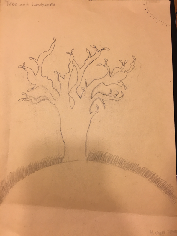
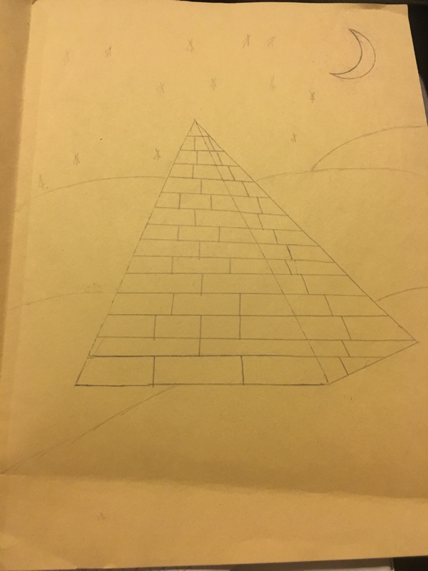
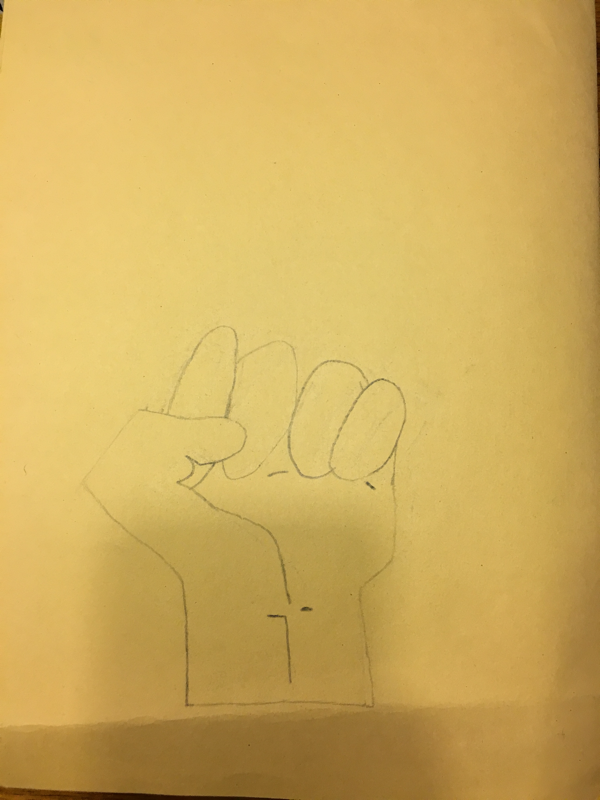
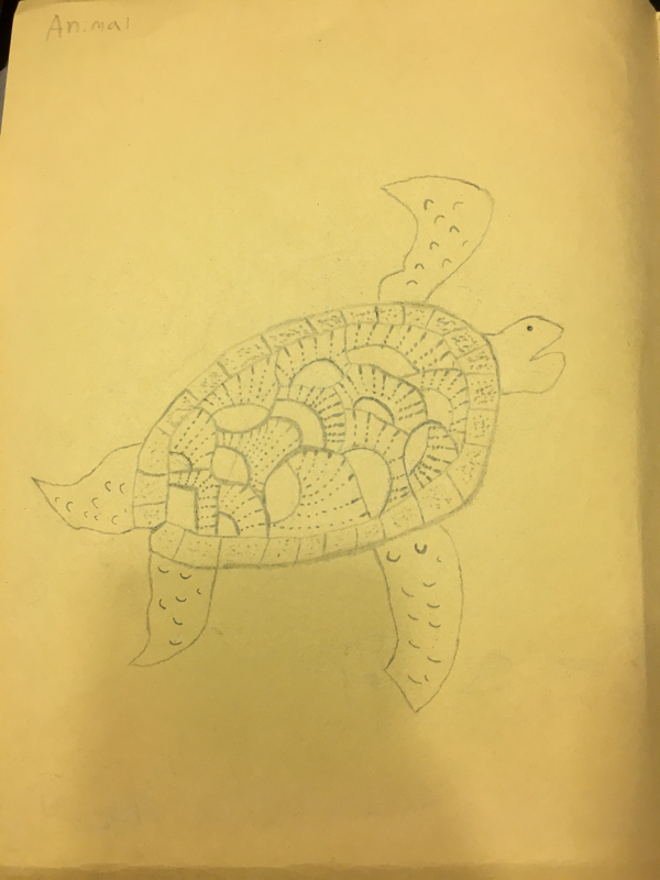
These are my 4 assessment drawings which include a tree, the Egyptian Pyramid, a turtle and a persons hand that is being made into a fist.
Here are my 4
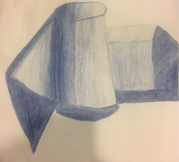
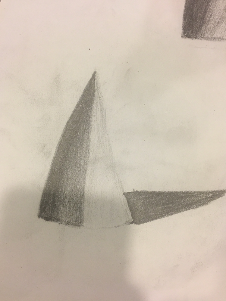
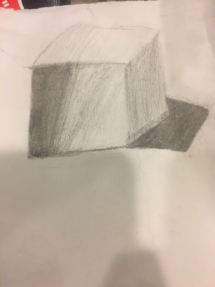
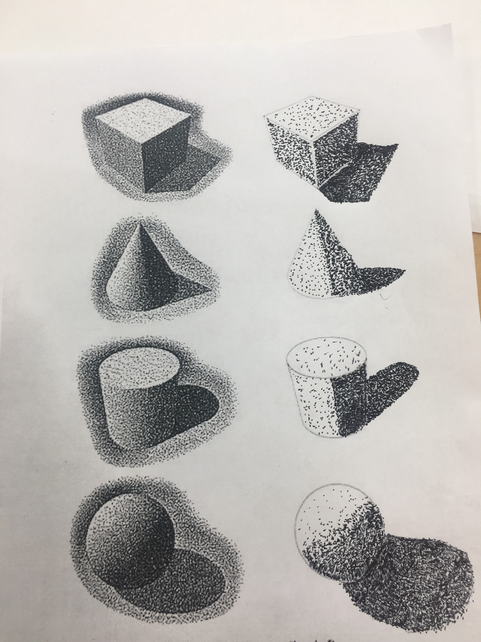
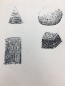
These are my pencil/color pencil shading drawings of a cone, cylinder and square. I shaded from dark to light and used a blue color pencil for the shading of the shapes.
|
|
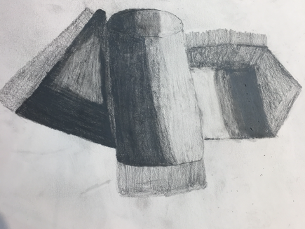
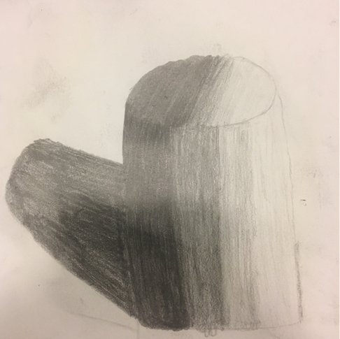
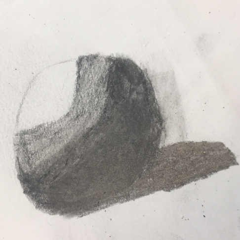
These are my 4 shading shapes which are a cylinder, sphere, square and cone.
|
|
|
|
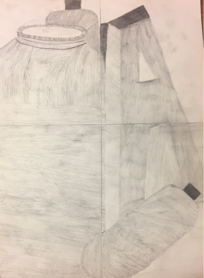
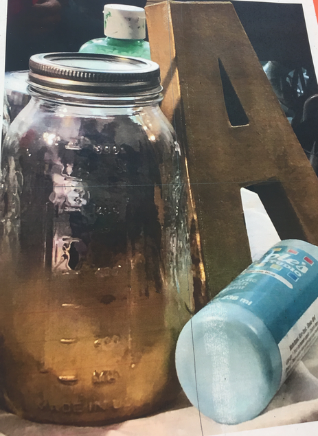
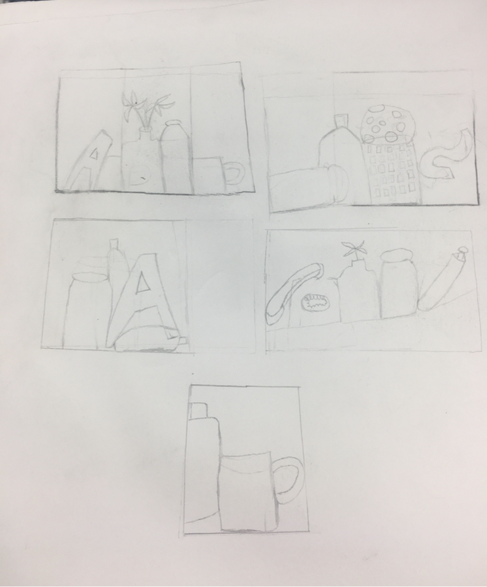
This is my Still life shade drawing which includes a jar, a paint container and the huge letter of A. Also this is my still life sketches too. I hope you like it.
|
|
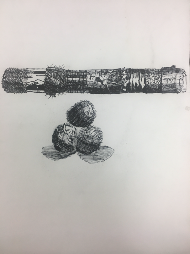
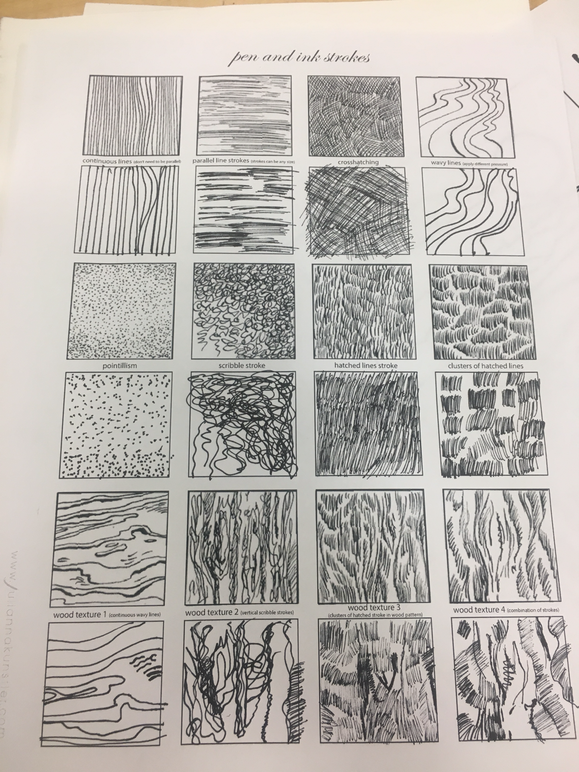
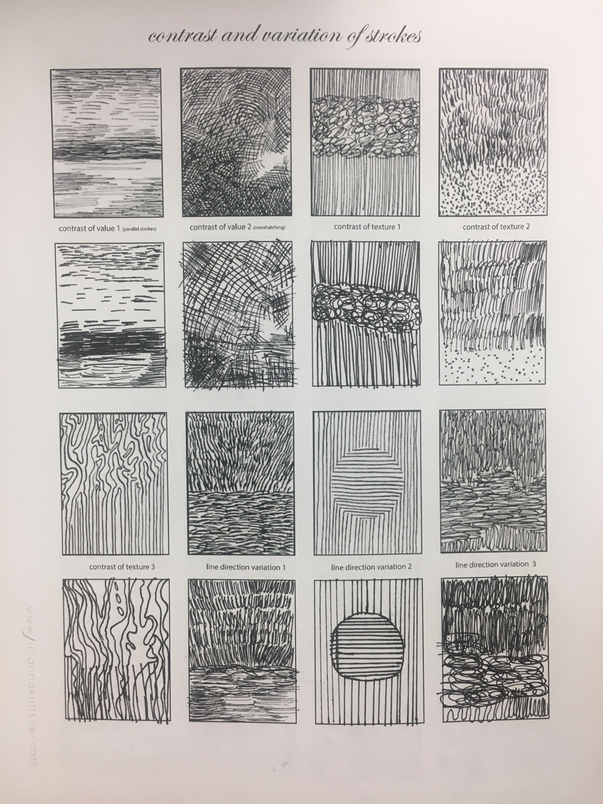
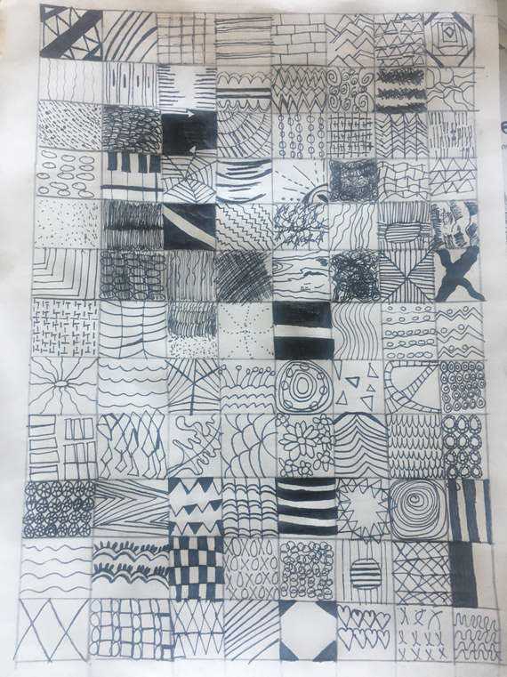
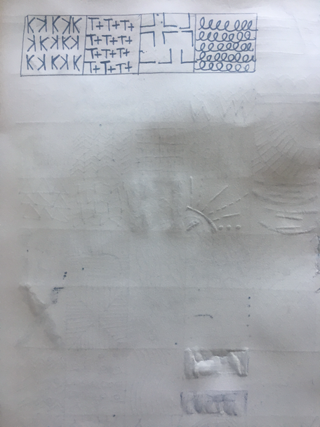
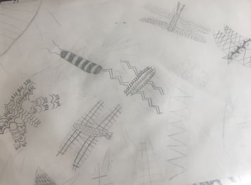
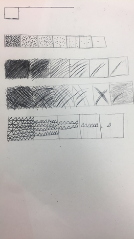
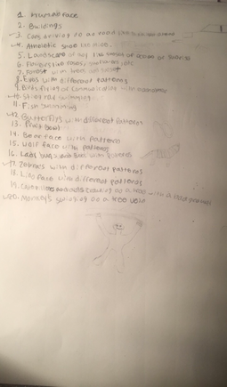
These are my pen and ink assessments. I hope you enjoy them. On the left, it shows the pen and ink video drawings of both assessments. Down at the bottom are the pen patterns for the four shapes and the practice ink patterns.
|
|
|
|
|
|
|
|
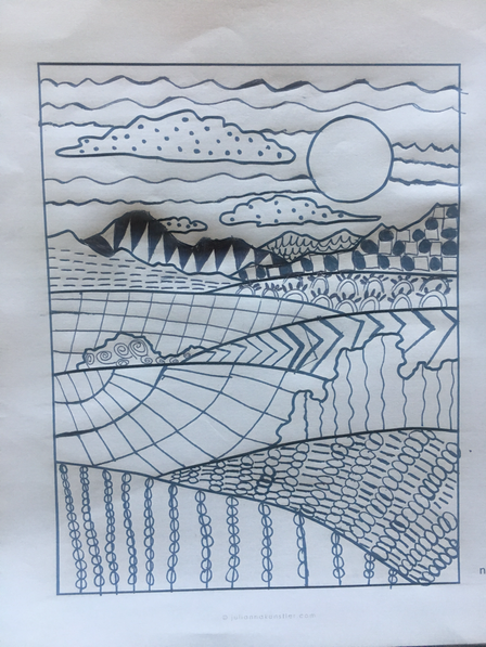
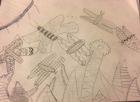
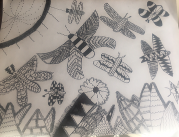
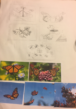
On the left, you can see the 3 progress pics of the pen and ink drawings of the butterflies and their habitat. Also you can see the 3-5 reference photos of the butterflies.
|
|
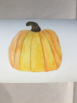
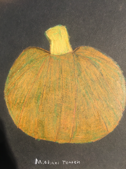
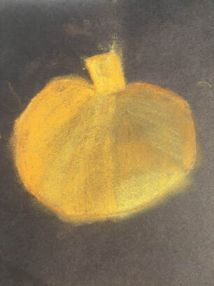
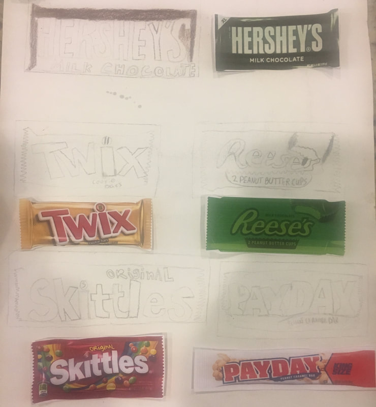
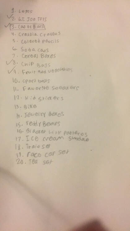
To the left and right, it shows the picture of the 20 ideas and 3-5 com positional pictures. Up top is the 3 veggie pics of a pumpkin that is watercolor, prisma and pastel.
|
Color Pencil/ Pastel Final
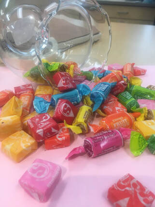
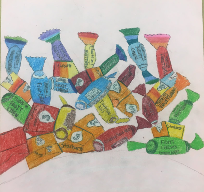
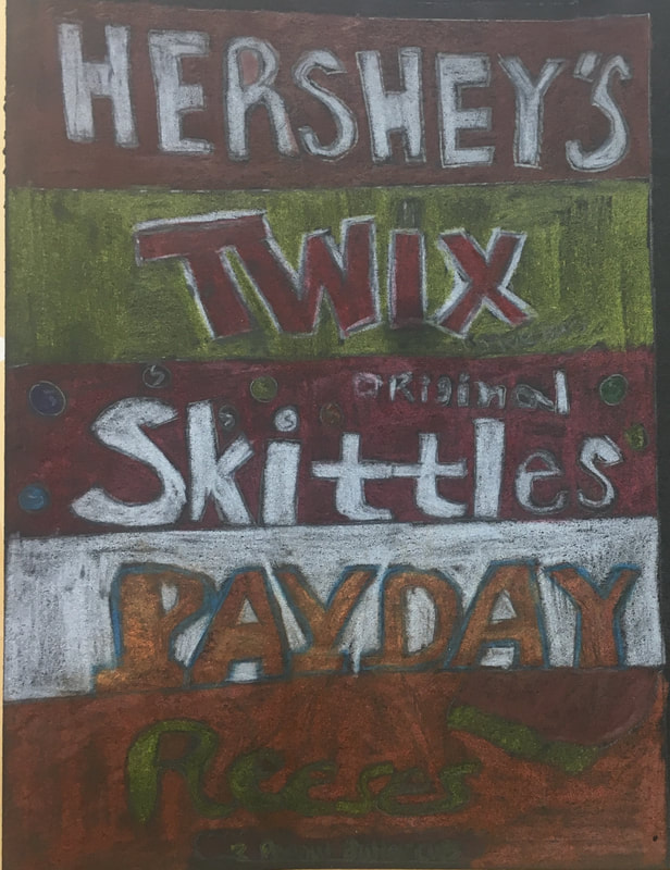
This is my Candy Drawing piece. I sketched starbursts and tootsie rolls in the pic. I hope you enjoy the art piece.
|
|
|
|
Art 2 CRITIQUE- Colored Pencil/Chalk Pastel cluster of objects
SELF EVALUATION
1. Describe the overall composition of your artwork (balance, unity, rhythm and movement). The overall composition of my Colored Pencil/Chalk Pastel project is that I wanted to use the best amount of balance and unity in my pieces. I wanted some of the pieces to be small and some to be big in perspective. I used unity a lot in both pieces because I wanted to bring the art piece together. I wanted both pieces to pop out and be noticed.
2. How did you use value to create dimension? Is this important? Why? It is important because you wanted the size of the art work to be not too big and not too small but the right size so it can pop out to the audience. I valued the use of dimensions because I wanted the size to be good and pop out.
3. What did you achieve by using exaggerated color? By me using exaggerated colors, it made the art piece stand out more by mixing different colors and shades.
4. Describe the craftsmanship of your colored pencil/chalk pastel. (How good the project is technically crafted) I think my craftsmanship of my colored pencil /chalk pastel was good and very detailed but, I do wish that I put more rhythm and movement as I did with unity and balance.
5. Were you able to achieve depth by showing a foreground, middle ground and back- ground? Explain. Well I did not achieve background and middle ground in my art piece but, I did achieve foreground. The foreground in my piece was the colors to pop out to the audience.
6. Explain your experience with colored pencil/chalk pastel. What were the obstacles and advantages? The obstacles I experienced with colored pencil/chalk pastel was mixing the colors together and to sketch lightly so it can be smooth.
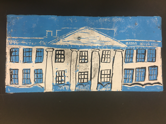
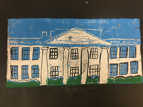
Screen Printing
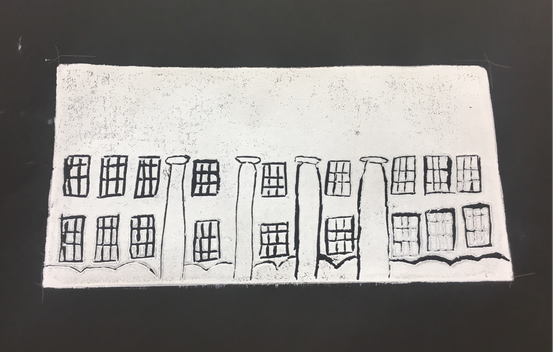
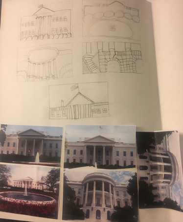
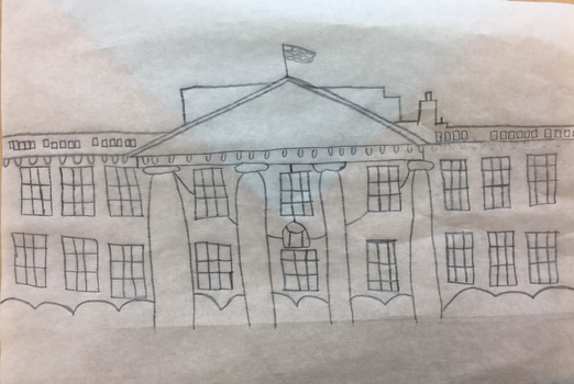
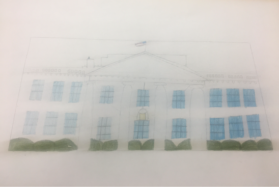
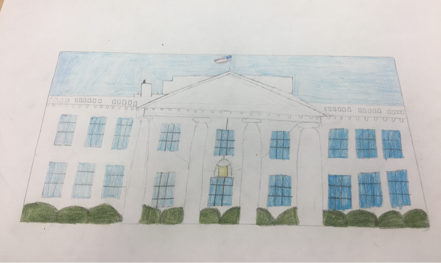
Here is my screen print project. I put the 3 in progress pictures and the title of my art piece is The White House. I hope you enjoy it.
|
|
SELF EVALUATION OF SCREEN PRINTING
-burnishing and ink coverage. My art print adapted ink coverage and brushing very good and quickly. It was the right amount of ink on the art piece. Not too light not too dark but just the right size.
-color harmony I should of used color harmony more in my art piece but the only colors I combined was white with blue and green with blue. I still used color harmony though in my art piece but I should of used more.
--balance The balance in my art piece was very good. I made the bushes small but not that small. The White House size in the piece was perfect and the sky was just perfect balance in the picture.
- Describe the craftsmanship of your prints. (How good the project is technically crafted)
-burnishing and ink coverage. My art print adapted ink coverage and brushing very good and quickly. It was the right amount of ink on the art piece. Not too light not too dark but just the right size.
- How did you use texture, color harmony and balance to define your choice of subject?
-color harmony I should of used color harmony more in my art piece but the only colors I combined was white with blue and green with blue. I still used color harmony though in my art piece but I should of used more.
--balance The balance in my art piece was very good. I made the bushes small but not that small. The White House size in the piece was perfect and the sky was just perfect balance in the picture.
- If you could recreate your pieces what would you do differently to enhance your final outcome? The things I would change to my piece would be the color harmony since I did not use that much of it and texture because it was neat but It could of been more neat.
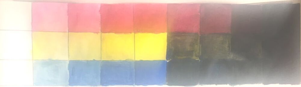
Painting Unit
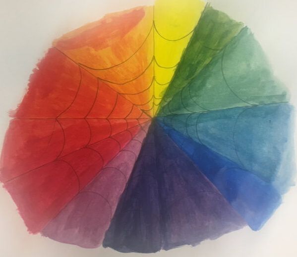
The two pictures shown below are the tints/shades and the color wheel. We had to use three colors for the tints/shades which were red, yellow, and blue. For my idea of a color wheel, I used spider webs.
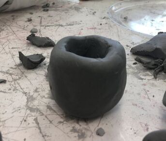
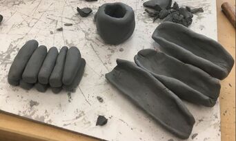
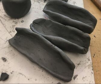
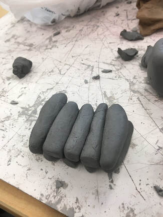
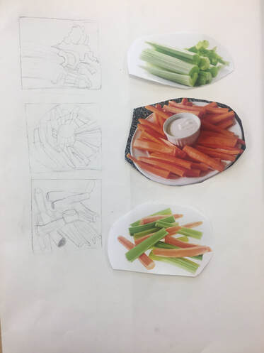
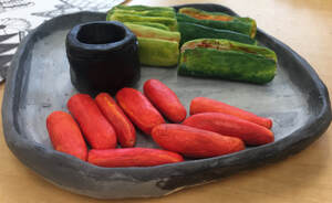
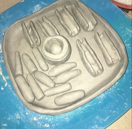
Clay Food Unit |
|
|
|
Clay Self Evaluation
What would you do differently if you were to do this project again? The thing I would do most differently would be creating more texture in the piece and to try out different textures like invented and actual texture.
- Describe the craftsmanship of your sculpture. (Is it neat and well executed?)
- What was the most difficult part of this project?
- Did your color choices work together harmoniously? Well I’m not done painting the objects on the plate but, I do think the colors will look perfectly executed and will harmoniously neat.
- Is your sculpture interesting from all views? Yes, because it shows how realistic the art projects look with the snack of baby celery with peanut butter and carrots with ranch on the plate. The art project makes you hungry and makes you want to eat it.
- Describe the differences in constructing a sculpture and doing something 2D. Doing something 2D is very flat but very artistic like a screen print or just a painting on a canvas. Constructing a sculpture is very neat and detailed which makes you see the whole project itself like a clay sculpture. In my opinion, I think sculptures are better than 2D art because they look more artistic to me and they are more fun to create.
- How did you create textures in your sculpture?
- Does your sculpture look like the actual food? How did you accomplish this?
What would you do differently if you were to do this project again? The thing I would do most differently would be creating more texture in the piece and to try out different textures like invented and actual texture.
 RSS Feed
